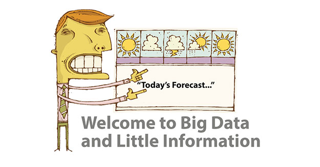
My wife claims that TV weather forecasters must have a strong lobby in Washington: How else can they justify taking five minutes of every newscast to tell us stuff no one can understand? It is a good example of the difference between data and information ― a key distinction often lost by data-driven marketers.
This is what data looks like: “Today, a weak area of low pressure is going to slide by to our south. Tomorrow, cold high pressure will build from the west and northwest. Then, a warm front from a developing storm in the Midwest will serve as the dividing line between cold high pressure retreating to the north, and a warm high developing to our south. The warm front is likely to stay south of us during the day, and high clouds should increase later on.”
This is what information looks like: “It is going to rain; take an umbrella.”
Notice the noise level in the data versus the call to action in the information.
There are many parallels for “foggy information” in data-driven marketing. Here are three tips to insure you convey meaningful information, not just data:
- Filter your data, to avoid “apples and oranges” comparisons.
For example, wholesale and consumer customers existing together in a marketing database will have entirely different buying patterns. Be sure your order management software can filter your customers properly. From our experience, M.O.M. software from Freestyle Solutions does an excellent job in this regard. - Less is more.
Avoid unending granularity in your marketing reports. Show the trend in the information, not all the drill-down data supporting it. Back to our weather analogy: If rain is forecast for the next three days, do you really care how much it will rain each hour? - Make sure your reporting is actionable ― for better decision making.
To say, “Wow, my response report shows 12% of our catalog responses are coming from California” may ignore the obvious (e.g., 12% of all customers reside in California). Consider Matchback Analysis instead ― a form of attribution where orders can be matched back to a mail history record. This actionable metric will guide the targeting of your next direct mail promotion.
The absolute master of this topic is Edward Tufte of Yale University. Long before “data visualization” was a buzzword, Tufte was creating beautifully illustrated texts on interpreting data. My favorite is “The Visual Display of Quantitative Information.”
Bruce Gregoire is founder and CEO of WiseGuys Marketing, in Falls Church, VA. Since 1998, WiseGuys proprietary software has helped catalog mailers target their customers with just the right offer at the right time ― using R-F-M Algorithms and data-driven ROI.


